You never get a second chance to make a first impression.
That’s why your homepage is undoubtedly one of the most important pages on your website. In fact, it’s the very reason why we just launched a brand new homepage design last week. For any given company, the homepage is its virtual front door — and face to the world. If a new visitor doesn’t like what they see, their knee-jerk reaction is to hit the “back” button.
That’s right. Despite mom’s best advice, unfortunately, a lot of people still judge a book by its cover.
What makes a homepage brilliant, and not “blah?” Well, it’s really about more than looks along — it also has to work well. That’s why the most brilliant homepages on this list don’t just score high in beauty, but also in brains. Get ready to learn about excellent homepage design through these 15 real-life examples!
Elements of a Brilliant Homepage Design
All of the homepage designs shown here utilize a combination of the following elements. Not every page is perfect, but the best homepage designs get many of these right:
- Clearly answers “Who I am,” “What I do,” and/or “What can you (the visitor) do here.” If you’re a well-known brand or company (i.e. Coca Cola) you may be able to get away with not having to describe who you are and what you do; but the reality is, most businesses still need to answer these questions so that each visitor knows they are in the “right place.” Steven Krugg sums it up best in his best-selling book, Don’t Make Me Think. If visitors can’t identify what it is you do within seconds, they won’t stick around long.
- Resonates with the target audience. A homepage needs to be narrowly focused — speaking to the right people in their language. The best homepages avoid “corporate gobbledygook,” and eliminate the fluff.
- Compelling value-proposition. When a visitor arrives on your homepage, it needs to compel them to stick around. The homepage is the best place to nail your value proposition so that prospects choose to stay on your website and not navigate to your competitors.
- Usability and mobility. All the homepages listed here are highly usable, meaning they are easy to navigate and there aren’t “flashy” objects that get in the way of browsing, such as flash banners, animations, pop-ups, or overly-complicated and unnecessary elements. Many of them are also mobile-optimized, which is an incredibly important must-have in today’s mobile world.
- Calls-to-action (CTAs). Every homepage listed here effectively uses primary and secondary calls-to-action in order to direct visitors to the next logical step. Examples include “Free Trial,” “Schedule a Demo,” “Buy Now,” or “Learn More.” Remember, the goal of the homepage is to compel visitors to dig deeper into your website and move them further down the funnel. CTAs tell them what to do next so they don’t get overwhelmed or lost. More importantly, CTA’s turn your homepage into a sales or lead-generation engine, and not just brochure-wear.
- Always changing. The best homepages aren’t always static. Some of them, like Whitehouse.gov, are constantly changing to reflect the needs, problems, and questions of their visitors. Some homepages also change from A/B testing or dynamic content.
- Great overall design. A well-designed page is important to building trust, communicating value, and navigating visitors to the next step. As such, these homepages effectively use layout, CTA placement, whitespace, colors, fonts, and other supporting elements.
1) FreshBooks
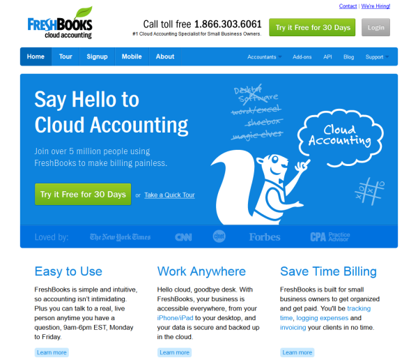
Why it’s brilliant:
- There’s great use of color and positioning with the primary calls-to-action — they jump right off the page!
- The copy used in the CTAs “Try it Free for 30 Days” is very compelling.
- The sub-headline is also great — “Join over 5 million people using FreshBooks to made billing painless.” It resonates with the audience because typically accounting software is “painfully complex” to freelancers and small businesses.
2) Mint
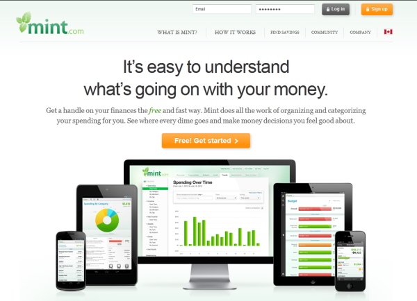
Why it’s brilliant:
- It’s a super simple design with a strong headline and sub-headline.
- The homepage gives off a secure but easy-going vibe, which is important for a product that handles financial information.
- It also contains a great call-to-action, “Free! Get Started,” and a very clear supporting image. Within seconds, visitors know this is an online (and mobile-optimized) software solution.
3) CloudPassage
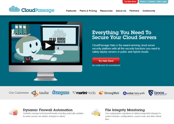
Why it’s brilliant:
- Besides the crisp, clean design, this homepage clearly conveys what CloudPassage does within the body copy and with a supporting video.
- There is only one call-to-action (which is perfect to guide visitors to exactly what they should do next), and to help reduce friction, they’ve included the message, “No credit card. No commitment.”
4) Box
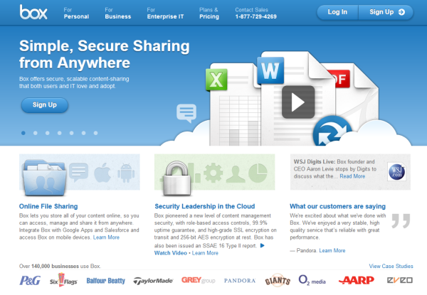
Why it’s brilliant:
- The Box homepage is a great example of using strong visuals and copy. Their headline is simple, yet powerful. The homepage also includes good “proof” elements by listing some of their top customer logos, along with the copy, “Over 140,000 businesses use Box.”
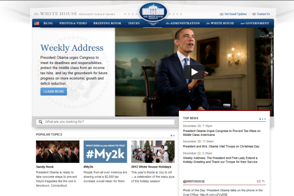
Why it’s brilliant:
- What’s particularly great about Whitehouse.gov is that it is completely unlike most government-related websites. It’s clean, web 2.0-like, and fosters a community.
- It’s fairly easy to find what you’re looking for when you land here. There’s even a “What are you looking for?” search box. What’s also great about this homepage is that it’s constantly changing to reflect top concerns and priorities.
6) Carbonite
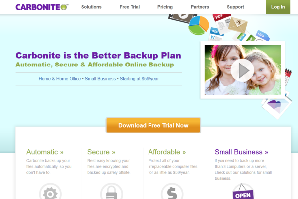
Why it’s brilliant:
- What if you lost all your family photos in an instant? That’s the disaster Carbonite helps you avoid, and they clearly convey that on their homepage.
- This page is also a good example of segmentation, by placing links for either home usage, or business usage.
7) Evernote.com
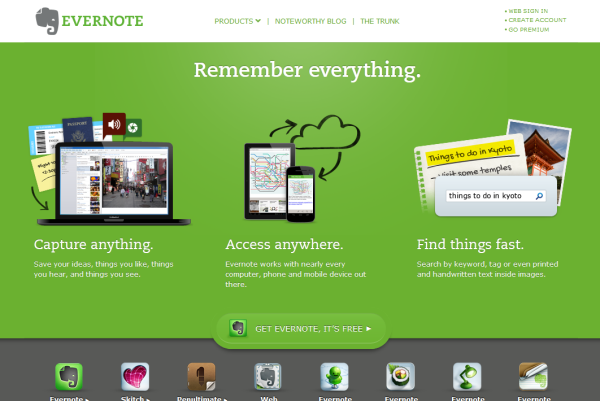
Why it’s brilliant:
- Evernote probably wins for the simplest yet best headline, “Remember Everything.”
- This homepage is arranged into three simple benefits that jump out due to the rich, green background color.
- The “eye path” then leads you to their call-to-action, “Get Evernote, it’s Free.”
8) Unlocking
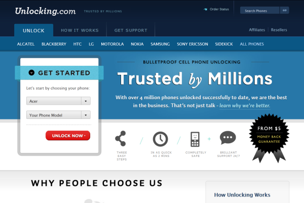
Why it’s brilliant:
- There’s no question what this website does when you arrive on the homepage. And while most visitors to this site probably know what cell phone unlocking is, they still include a small description on the page.
- This homepage has great contrasting colors and strong proof elements. For example, “Trusted by Millions…over 4 million phones unlocked.”
- We also love the short form placed directly on the page, instead of using a button to send visitors to another landing page to get started.
9) Desk.com
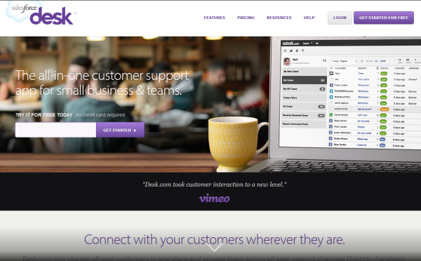
Why it’s brilliant:
- It’s a very simple, yet beautifully designed homepage with a great product screenshot.
- Their headline is strong, with zero fluff.
- Desk.com uses a form directly on the page to get started with their free trial.
10) eWedding
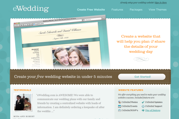
Why it’s brilliant:
- For those love birds planning their big day, eWedding is a great destination to building a custom wedding website.
- The homepage isn’t cluttered and only includes the necessary elements.
- They’ve included excellent product visuals, a great headline, and an excellent call-to-action that reduces friction with the copy, “Create your free website in under 5 minutes.” Genius!
11) Basecamp
.
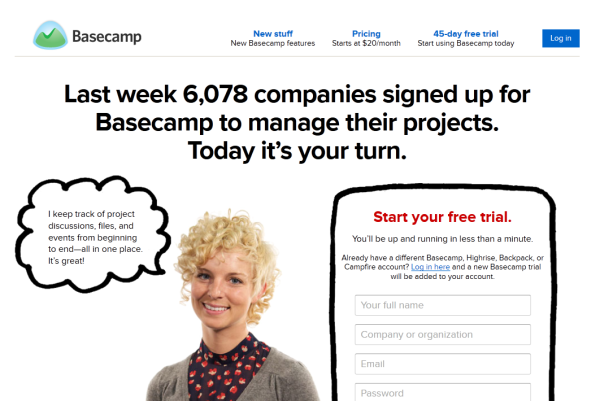
Why it’s brilliant:
- For a long time, Basecamp has had brilliant homepages, and here you can see why. They feature awesome headlines and put their customers right at the center of their marketing.
- There is also a sign-up form directly on the homepage, to skip the step of going to another page
12) Eventbrite
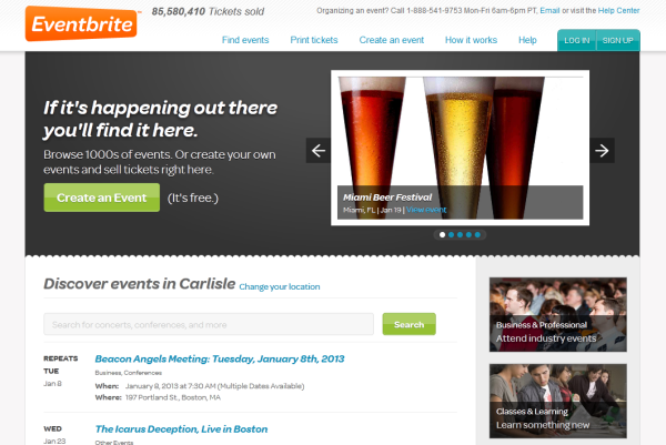
Why it’s brilliant:
- The headline on their homepage, “If it’s happening out there you’ll find it here.” is great, because it sparks curiousity.
- It then follows into the sub-head where visitors can either browse thousands of events, or choose to create an event.
13) GoodData
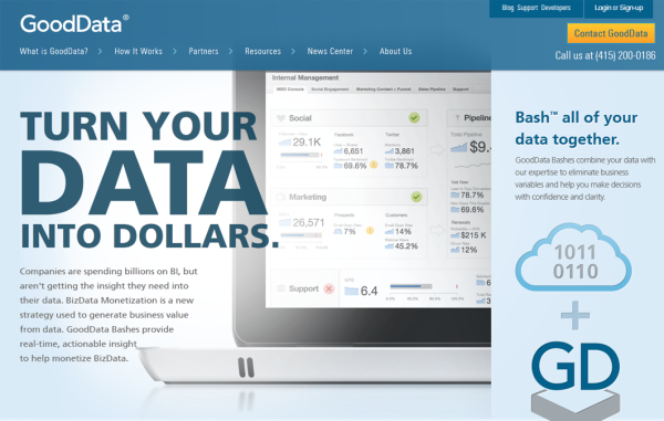
Why it’s brilliant:
- This homepage is a bit non-traditional, but that’s just one reason it’s so brilliant. There’s a very big headline, and it directly speaks to all the data-crunchers out there.
- The image helps visitors see how their product fits into their daily lives — a visual use case, if you will.
- The one thing it’s missing, however, is a clear call-to-action. Hopefully that will be in their next design.
14) TechValidate
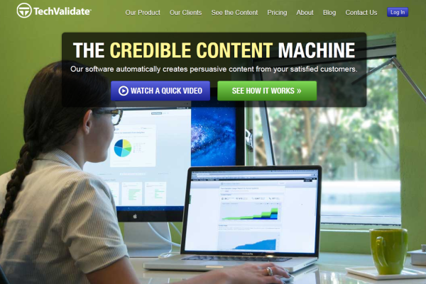
Why it’s brilliant:
- This homepage is beautifully designed. I particularly love their use of white space and contrasting colors
- The headline is clear and compelling, as are the calls-to-action.
- Making the copy “credible content” stand out in yellow helps readers instantly understand the company’s value proposition.
15) Endeavor.org
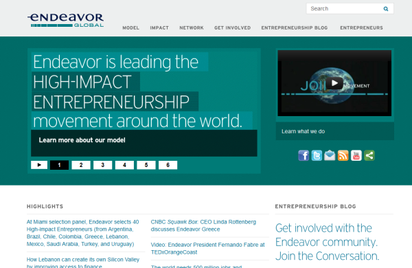
Why it’s brilliant:
- This homepage might not look the most exciting, but it executes many things well. To start, the headline is fantastic, because it makes you want to learn more.
- Second, there is also a supporting video to teach us more about their mission — a great use of multimedia, visual content.
- The social sharing modules on the homepage help the homepage get more visibility among a wider audience — particularly important for a .org or any community-oriented website.
What do you think of these homepages? What are your favorites? Are there other great websites I missed? If so, list them in the comments!
Posted by Jessica Meher
